this video, recorded by a member of my group, shows the views and opinions of our trailer given by our class mates.
Category Archives: final product
trailer print screen– link to the print screen shots
This first screen shot, from the opening scene of the trailer, shows both of the two main characters, ronnie and jason, standing in a room plotting their plan to steel from the Russian gang, enhancing the main plot of the film to the audience. This shot has dietetic talking and no music over it. This is done so that the audience are aware that the conversation is the main focus of the scene. the filter that is over this shot, and over every shot in the trailer, is done to enhance a ”Lock stock and two smoking barrels” feel to our film, as we wanted to achieve the same gritty feeling as that well know film does.
This second screen shot is of the two characters cooking the illegal substance. This shot is very important in the opening of the trailer, as it allows the audience instantly to get an idea of what the two main charters, seen at the start of the trailer, do in the film. This shot has a non-dietetic voice over narrated by the character ronnie. In this voice over, he talks briefly about the struggle that they are in with the Prussians, after going through with the plan that they we’re talking about in the begging. We got inspiration to do this scene from the TV show ‘Breaking bad’. The idea of Ronnie wearing an apperan in the cooking scene also came from ‘Breaking Bad’, and was done to add the element of comedy to our trailer.
The third screen shot is from the scene moments after the character jason would have got captured in the film. in this scene, the audience can see the character jason getting tortured. this allows the audience to see that there will be a physical conflict through out the film between the characters. we wanted to do this shot in first person to create mystery for the audience, as they don’t know who is actually attacking jason. The black and white cartoon effect was inspired from the film ‘sin city’, where the whole film is shot in a comic book style. We did this to create originality, as you don’t usually get any shots like this in a typical action film.
The fourth screen shot is of the map, showing the different locations that the two main characters have been selling their illegal product around the world. the image shows the arrow going from Birmingham, the town where the two drug dealers work and live, going to a location where the Russian work. this image allows the audience to get a clearer understanding of the plot, without the narrative having to explain it.
the fifth screen shot is from the scene where the character jason gets tortured by the russians. this scene, in the film, would follow on from the scene where jason is getting tortured in the fan. the russian character wears a pig mask during this scene to create mystery, as the audience don’t know his true identity. We did this to fit the typical conventions of an action/thriller film, even tho we went against it throughout many parts of the trailer.
the sixth screen shot is of the main russian villain, standing at the top of a stair way looking sinister and mysterious. this scene is the first time the audience see the villain in our trailer. in the scene, it is evident to see that this character has a weapon, enhancing his evil ways and showing the audience that this character is part of the main conflict in the plot.
the seventh scree shot shows the main fight scene in our trailer. this fight scene was done to meet typical conventions, as in every action film there is usually a fight scene, weather it’s a fist fight or a gun fight. this scene also allows the audience to know what genre the film is. the fight scene is between one of the drug dealers, jason, and the main police officer.
the eighth screen shot is of the poker game in the film. the idea that the drug dealers run a poker game every so often goes against the typical conventions of what you would usually expect in a an action film. we got inspiration to do this from the film ‘lock stock and two smoking barrels’.
the last screen shot that i will be talking about is the shot of the main Russian villain, the police officer and ronnie, one of the drug dealers, pointing guns at each other. this shot enhances the main convention of an action film, and it lets the audience know that there is a conflict in the film.
final magazine

This is the final magazine cover design. as much detail as we could, about the information you can expect to find inside the magazine. we have also put a lot of thought in to the colour scheme of the magazine cover. we left the back image dark, as it was in the process stage, however we put the magazine name, ‘flick pick’ in red, to enhance the action convention of our trailer. the yellow font colour of the text stands out and is more eye catchy to the audience. we added an effect over the dominate image to make it look like it is raining. we got the inspiration to do this from how the sin city graphic novels look. the editor uploads the effect on the image after the photo has been taken. lastly, we added a bar code to the magazine to make it look professional.
final trailer
final poster
for our final poster, we have decided to go with this poster. this is because my group, and several teachers who we asked, thought that this poster relfects the conventions of the genre more than the other posters i created. The two image are more clear, and are easy to make out from a distance, where as the other posters i created had an image that was quite hard to make out what it actully was. the image beforee had to much effects over it, which was the main reason you couldnt tell what it was. it was alos unclear of what the genra was on the previous posters, where as the final poster allows the audience to see the conventions of our film from both the image of the gun and the poker game.
How effective is the combination of your main product and ancillary texts?
All of our products involved contain the right amount of conventions that are needed to make them work really well together. We managed to find the right image to use on our poster that’s from a shot in the trailer, and is a crucial moment in the plot line and even in our early stages of our planning we said we really like the idea of the shot. This is the Russian roulette shot and we didn’t quite know where it was going to be in our trailer but we knew that we wanted one. Once we managed to fit it in we knew it would be a great moment in our trailer and would also look good on our poster. Although this went against our planning we thought it would work a lot better and stick to the conventions of a poster more than our earlier ideas would.
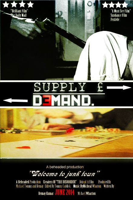
This image on our poster has given a really good sense of life vs death and is intended to give the audience a feel of mystery because they do not know what’s going to happen to the hostage with he gun to his head. This is part of the enigma code built up in our trailer and poster. I feel that this is the most iconic shot in our trailer and that one that really stand out to the audience and that’s why both the poster and our trailer work very well together, they support each other and give such a strong sense of mystery and really support our genre. The poster also has the nick name of where our film is set “Junk Town” which we thought of early in our planning stages and our slogan “welcome to junk town”. Again, this gives a real sense of the tone of the film, it makes the film sound gritty and the audience clearly knows that there is a sense of unease in “junk town” and it is a dangerous place. This further supports the genre of the films and the general tone of the films and we felt “welcome to junk town” also connotes something quite un nerving.
Our magazine cover is another part of our overall product that really reinforces the tone of the films and the overall genre and what the audience is supposed to expect. But, the main difference between the poster and the trailer and the magazine cover is that the magazine cover features the two main protagonists on the front.
The image alone gives off a feeling that they aren’t hardened criminals like you’d expect them to be, they just look like young adults who have gotten into some trouble. You can tell by the image that they try to be as professional as they can because they are wearing shirts and ties, but they still look quite scruffy and it’s clear that they aren’t really on a professional level yet, which is the main plot point and why they want to see to the Russian villains in the first place.
The low angle used on the magazine could be interpreted in two ways, that they have risen from the poverty of ‘junk town’ and they are doing well or perhaps it could show their ambitions and where they want to be and sort of provide and eye line match of where the main protagonists see their selves.
The location where the photo was taken was in front over a rusty, gritty crate container. It gives an industrial feel which i think really adds to how the audience should feel about the location of where the film takes place as the trailer doesn’t show much of that as it is mostly indoors and you don’t see a lot of the outside and the streets. So the picture gave us a perfect sense of what the location and the streets in the film should be like.
In conclusion we use all three of our products to support each other by reinforcing certain conventions to give off feelings of enigma and mystery, unease and to give the audience a perspective through the main characters eyes as in where they see themselves and where they live and where the film takes place. I feel they work really well together and add the authenticity of the genre and tone of the film.
What have you learned from your audience feedback?
After our final production was finished, we thought it would be a good idea to show it to our class, to get different oppinions and see if there was anything more we could do. we asked them to tell their thoughts on the trailer over all and asked them what is good, bad, and what could we improved on. the feed back we recieved was, overall, very good. the audience told us that they enjoyed our production and thought there was very little would improve on. one strong point that we recieved from the feed back is that the audience was able to see typical conventions of the genra of our trailer. simularly, they also managed to see how we went against some typical convention, which we viewd as a positive because it is what we tried to achieve when making or production.
during the feedback, it was evident to us that we had used the right amount of conventions that you would usually expet to see in a brit filck. the audience was aware that in a brit-flcick/crime dramaI, there usually isnt things like explosions in their, like you would expect to see in a typical action, however we did include the things like a fight scene, wepons, a antagonist and a protagonist. it is these kind of conventions that made it clear for the audience to identify our trailer as a crime drama. The audiece also told us how they enjoyed the use of the ‘Michael Bay shot’ in the trailer, a they was aware it was a hard shot to edit. despite this, they told us that it wasn’t really a typical convention shot that you would exect to see in a crime drama film. They said it wold have workedd better if our trailer was an action film, as the shots used in many action films like ”transformers” and ‘Bad Boys 2′, which are al films directed by michael bay. That made it clear to us that we managed to challenge the conventions, and our selves.
lidjano, who is a class member doing a simular film to what my group was doing, also used films such as ‘Lock, Stock and Two Smoking Barrels’ and ‘Snatch’ in his research during his pre production stage. he liked the fact that we went against the typical convention of using an adult to be the main character, as in our film the main characters are teenagers aged 18-19. this usually wouldnt be seen in a typical action film like in the ‘James Bond’series, however this was one of the main things we wanted to do inorder to cchallenge the typical conventions.
when we asked the audience what we could improve on, most said that we needed to make the story more clear in the trailer, as they belived for someone who didnt already know what the films was about, it would be hard to guess just from looking at our trailer. this was a problem that my group adrewssed in the production stage of making the traile. because of this, we added an animation in our trailer, showing how the characters in the film go toseveral countries to maje the drug deals. this, along with the voice over narating the plot was how the audience started to realise what the film is about, howevere thy still thought the shots we recorded didnt tell much about the story, when they should.
In what ways does your media product use, develop or challenge forms and conventions of real media products?
Question 1- the genre of our A2 media product is a crime drama/brit-flick. We wanted to try and do this type of film to challenge ourselves, as the conventions of these types of films are very different to other genres of films. For example, crime dramas usually consist of action, a list of main characters and a main plot. However, considering we aimed to include elements of the brit-fick style film, we tried to add elements of comedy in to our product, which we found was a difficult thing to achieve, as no one in our group is remotely funny. Despite this, I believe that the final product mirrors the film ‘Snatch’, which was one of our main goals we wanted to achieve. This is due to the consistent quick shots of footage, the still shots of the characters in the cartoony filter and the voice over. Because of these conventions, I don’t think our final product related to the stereotypical action genre, which I believe shows originality and creative thinking. The final poster design, I believe, doesn’t contain the typical conventions you would expect to see in on an action poster. Usually, the audience would find explosions or an image of the main characters, with a variety of colours, where as our poster consists of just 4 colours, and a main one main image of a gun and a hostage. Despite this, the colours consist of red white and blue, enhancing the colours of the British flag; giving the audience and idea of where the film is going to be set.
The idea that we had to follow the media genre conventions was evident for us as we began first thinking of the magazine design, as we found it hard to do a magazine that goes against typical conventions, so we thought that we would a typical action magazine, containing typical conventions. This was the most challenging thing we had to do in terms of getting the right the conventions. Because of the challenges we came across, such as the not being able to put explosions and still action scenes on the front cover of the magazine, we had no choice but to create a new design that went against typical conventions. We added an image of the two main characters on the magazine as the main dominate image. Despite the fact it goes against typical conventions, it still allows the audience to know who the main characters of the film are.
question 2
i used the same media conventions, used in myA2 trailer, to influence the outcome of my poster and magazine. It is evident to see he action/britflick genre conventions in my poster, as the front cover is the image of a gun aiming at a hostages head. The image of a gun is typically used in the action genr, weather it is evident in a trailer, poster or a magazine. Despite this, i used the colours to enhance the conventions of a brit flick in to my poster. i used colours were red, white and blue, to show the audience that my trailer is about a British film, and i used the grainy western colour scheme to bring out a unusual look, as britflicks are usually like no normal action film. The western look also gives out a ‘Quinton tarantion look’ to the poster. i know this well know director doesn’t usually make britflick films, however he is very famous for pulp style films, and this is another genre that we wanted our film to be. One main convention of a britflick film, which we all wanted to use, was the type writer typography, which we was inspired to use after viewing the ‘Snatch’ movie poster.
similarly to our movie poster, when creating the magazine cover we wanted to achieve the britflick look to link with our film. As stated before, a brit flick film poster/magazine usually looks different to a typical action poster, meaning that it doesn’t contain explosions or anything dramatically conventional. Because of this, we all decided that our magazine’s dominate image should consist of having our two main characters standing directly in front of the camera. This lets the audience know, at first glance, that these particular people on the main image are going to have a big role in the film. We wanted to have simple, but bold magazine title typography, in order to make the title of our film stand out more and catch the audience’s eye better. the typography for our films title consists of the word ”supply” being in a type writer font, and the word ”demand” being in a Russian style font. This is to show the contrast between the two main enemies’ in the film, and let the audience know that there is going to be an issue/conflict.
How did you use media technologies in the construction and research, planning and evaluation stages?
Whilst in the research and planning stage of my a2 project I used several media technologies to aid the final outcome of my project. I used media synergy, such as internet use on computers and phones, in the planning and research stage. Because of this synergy, I was able to access information whenever I needed. In the first stage, when deciding what my trailer should be about, I used the internet to research different genres, which concluding in me finding several crime drama/Brit-flick films such as snatch, that I thought would be the best and most challenging genre to use. Not only did I use synergy to discover inspiration for my trailer, I also used it to find different poster and magazine designs that best suited my genre. Because of us browsing, I have been able to access the website ‘word presses’, which has allowed me to regularly blog my work and upload the first stages up to the very last stage.

When designing the poster, I used the software ‘Fireworks’. This software allowed me to design my poster, and allowed me to work with many different colours, typography’s and layout designs. Within the first stages of creating the poster, I found that using this particular software was challenging, as I have never designed anything using it before. Despite this, I soon got used to the software, and was able to design my poster a lot quicker than when I first started designing it. I designed four different designs, and chose which one I believed looked and suited the conventions of our genre the best. Throughout the stages of designing the posters, I thought it would be a good idea to design a poster on different software, to see how different it is to the software I was currently using. I decided to use ‘serif photo plus’, and I found this software quite easy to use, as it is simualr to fireworks, however I was used to the format of fireworks, so I decided to stick with the original software.
The use of the internet was very helpful in the pre-production stage. Being able to upload research to my blog on word press enabled me to always keep track of what I have be looking at and allowed me to change anything, If ever we changed our ideas in the production stage.
I used other types synergy’s, including social networking whilst in the pre-production stage. Whenever I was at home, or out, and I viewed a new trailer that I though was similar to my trailer or if I thought I could use elements of it, I would tell a member of my group via social networking to see what they thought about I, and if we could use it to better our trailer. You tube and IMDB was also helpful to view trailers and get information about a film.
In the production stages of recording, we first used a standard phone. We wanted to use a whole range of media technologies to gather the footage, which is why we shortly after stopped recording with phones, and started using a HD camera, which was very sufficient and better quality, which benefit the final look of our trailer as it made it look more professional. We also used tri-pods to shoot all of our scenes, in order to get a better focus on the camera and to give the shots a more professional look. We used the tri-pod for still shots establishing shots, tracking shots and crabbing shots. It made the camera very steady compared to when we didn’t use the equiptment.
