Category Archives: Uncategorized

magazine process

magazine1

This is how the magazine originally looked during the first stages of the production.  it is evident to see that the magazine is a rough draft, as it only contains the magazine title, the dominate image and the films title so far. we like the look of this magazine, even tho it goes again the look of our original design we had in mind. despite this, this design, when finished, will have the same dominate image and the same typography, however we will add effects over the dominate image and add minor detail to make the finish product look like a professional magazine. One of the hardest parts that we believe will be our biggest struggle with the creation of the magazine is to include the conventions of action magazine in to it. At the moment you can clearly tell that the magazine idea hasn’t got any conventions, however the product should do.

magazine2

this, as you can see, is the progressed version of the magazine cover.  It is evident to see how it has progressed, from the newly added filter over the dominate image, and the information about what to expect inside on both sides of the cover. we believe that the filters make thee magazine cover stand out more and make it look more professional. one filters that we used was the ‘colorize’ effect. this enhanced the dark colour effect that the magazine cover has, instead of having the original colour of the photo that we took. drop shadows have also been used on most words on the magazine to make them stand out more. despite this, on the words we couldn’t add a drop shadow to, we  duplicate the words that i wanted and move them slightly to the right and down to make it look like a drop shadow.


final poster


SUPPLU AND DEMAND POSTER 2

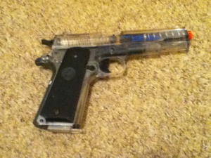
for our final poster, we have decided to go with this poster. this is because my group, and several teachers who we asked, thought that this poster relfects the conventions of the genre more than the other posters i created. The two image are more clear, and are easy to make out from a distance, where as the other posters i created had an image that was quite hard to make out what it actully was. the image beforee had to much effects over it, which was the main reason you couldnt tell what it was. it was alos unclear of what the genra was on the previous posters, where as the final poster allows the audience to see the conventions of our film from both the image of the gun and the poker game.

Poster Evaluation

Layout

For our final poster design, we slightly moved away from the ‘grand theft auto’ idea we originally had. We did however; add two images going across the page instead of having 4 small images in a box shape on the page. I spaced the two images out from one another, leaving a gap in the centre of the poster. Within this gap, I put the title of the film there to stand out and let the audience know the name of our film.

Font

The font of the text has two styles. The word ‘supply’ is done in a type writer font. This is done like this because police officers stereotypically have files written in a type writer font. This shows that the police are after the suppliers. The word ‘demand’ is in a Russian, showing the audience that the demanders are the Russians. The letter ‘&’ is a ‘£’ sign, to show that money is the main objective in the trailer. The word ‘E’ in the word ‘demand’ is in red to represent danger. It shows that the Russians are dangerous people.

Images

Both images were taken from stills in the trailer/ the top image (black and white) shows a Russian about to shoot a drug dealer. The fact that the bag is over the individuals head, and the shooters head is out of camera creates enigma and mystery towards the audience. It is in black and white to show depression and sadness, as someone is about to get killed. The bottom image is also taken from the trailer, in the poker scene. This image shows the scene where the drug dealers, the undercover police officer and the main Russian play a game of poker. It is in colour to show a brighter side to the film, which corresponds with the theme of action and a hint of comedy. I imported the image of the poker chip being thrown in the air separately. I did this to create a 3d effect, to create the effect for the audience that they are part of the action. I wanted to create the poster to look old fashioned, as like our film. To do this, I added a ‘HD grunge effect’ to the poster, which makes it look dirty and old.

improved story board

story board new 1

story board new 2

Shot 1 – This first shot  is of the two main drug dealers, ‘Jason’ and ‘Ronnie’. The audience can see them making the drugs that they plan on selling. this scene will be shot in Michael kitchen, which is going to be known as Ronnie’s kitchen in his appeasement. We got the idea to do this type of shot with these camera angles for this shot fom AMC’s Breaking Bad’. The shot will be a point of view shot from the container we are cooking in. we will put the camera under the container, whilst me and Tommy (Jason and Ronnie) look down at the ingredient in the container.

Shot 2 –The beginning  of the ‘Michael Bay shot’. This continuous shot starts in the kitchen, and track the character Ronnie in to the living room and pans past the character Jason as he sits down. The characters Ronnie and Jason then go out of the shot whist the camera  goes  into the doorway where you can see the front door.

Shot 3 – Part 2 of the ‘Michael Bay shot’. In this part of the shot the camera goes through the front door, where the audience can see the character Mike, a police officer, at the front door ready to breach in. This creates suspense as the audience knows that the officers are out side however Ronnie and Jason are inside oblivious to what is about to happen.

Shot 4 – Part 3 of the ‘Michael Bay shot’. This is where the camera will move in a tracking shot motion along the drive and then goes through the window again as the police break down the door.

Shot 5 – Part 4 of the ‘Michael Bay shot’. In this part the camera will go through the window and see Jason and Ronnie panicking and trying to hide the drugs.

final magazine cover- draft

final poster design

as you can see, as a group we have slightly altered the original magazine design. it hasn’t changed much, however we decided it will look better if we only have one main character in the dominate image. we still have the city in view behind the character as he walks down the street. For the title of my magazine, we have chosen ‘The Flick Pick’ for our masthead, which we believe is a good title and design as the image of the film reel above the letter ‘I’ indicates the magazine is for film purposes. We also spelled the word ‘flick’ like ‘flic’ as part of the design.  The text will be in the two different colors. thee word ‘The’ will be in red whilst the word ‘pick’ will be in white. this shows a contrast in colour and will stand out, catching the audience’s attention because of how bold it will be.

The dominate image is of the character ‘Jason’ walking in front of a sign with the film’s slogan ‘welcome to junk town’ on it and infront of a building which looks rundown. this slogan relates to the rundown and corrupted city that the film takes  place in. It also setss the scene and theme for the film.

Shot discussion ‘The Michael Bay shot’

As a group, we found it difficult to story board this particular shot. instead of making a really bad story board that is hard to understand, we decided to film us talking about the shot in order to get a clearer understanding of it. We discussed and illustrated the shot  with a diagram. we also couldn’t name this shot so we decided to call it the ‘Michael Bay shot’. This is because the well know director, Michael Bay, who is famous for directing the well know Transformer films, uses this shot that we talk about in a lot of his films.

Poster Idea 3

poster idea 3

This is our final poster idea, designed by me. i believe that this poster shows typical conventions of a action poster. The main image is of me and Tommy, the two drug dealers standing in front of a city. I did this to show how low the two characters are compared to the huge city that is behind them. Despite this, you can also argue that these two characters are infront of the city because they are litrally dominating the city, and the city deserves no more but to stand behind these two ‘kings’.

The characters are holding shovels in reference to a scene in the film, they are digging up a grave for a body. this also lets the audience know that there will be a lot of action and maybe even some gory scenes in our movie, teasing the audience.

As a  group, we have decided that this poster design would suit better for a magazine design, so we have chosen this to be our magazine cover. this is because we believe that the dominate image on the design will look better of the front cover of a magazine as the audience are instantly drawn in and aware of the genera of the film. We have decided to take both our first and second poster design and combine them in to our final poster design. This means that one of the images on the first poster will be the image that is in the second poster design.